Tracking Legislator Voting Patterns
How do US legislators vote once they get elected? Or, perhaps more dynamically, how do they react to external shocks (e.g. the dissolution of the Soviet Union, 9/11) that might blur partisan lines? More generally, how does voting behavior change across time and space? Let’s try to provide some answers to these questions using R. You can jump straight to the interactive Shiny app by clicking here.
Data
Organizations such as the Americans for Democratic Action, among other things, track the consistency of the legislators by documenting their voting patterns after they get elected. An aggregated version of their data, compiled by Justin Briggs, provides district-level voting data grouped by year, state, chamber, and party from 1947 to 2015. In addition to the nominal ADA voting scores, he also provides adjusted scores based on this post by Tim Groseclose. Let’s take a look:
library(dplyr)
library(readxl)
adaData <- read_excel("ada4715.xlsx") #aforementioned dataset
glimpse(adaData)
## Observations: 36,432
## Variables: 13
## $ Year <dbl> 1947, 1947, 1947, 1947, 1947, 194...
## $ Congress <dbl> 80, 80, 80, 80, 80, 80, 80, 80, 8...
## $ ICPSR <dbl> 937, 3754, 195, 4471, 7695, 4892,...
## $ `Full Name` <chr> "BOYKIN, FRANK WILLIAM", "GRANT, ...
## $ State <chr> "ALABAMA", "ALABAMA", "ALABAMA", ...
## $ StateAbbr <chr> "AL", "AL", "AL", "AL", "AL", "AL...
## $ Chamber <dbl> 1, 1, 1, 1, 1, 1, 1, 1, 1, 1, 1, ...
## $ District <dbl> 1, 2, 3, 4, 5, 6, 7, 8, 9, 1, 1, ...
## $ Party <chr> "Democrat", "Democrat", "Democrat...
## $ Nominal.Score <dbl> 33, 83, 83, 75, 91, 83, 91, 91, 7...
## $ Alt.Nominal.Score.Groseclose <chr> "25", "75", "75", "75", "92", "83...
## $ Adjusted.Score <dbl> 24.017374, 70.699040, 70.699040, ...
## $ Mean.Adj.Score <dbl> 22.56041, 29.70871, 23.96539, 52....Looks pretty good. Still, some dplyr action will be needed to accomplish the task. We are probably interested in some sort of average score for comparison purposes. For starters, we can get the yearly averages by chamber and party:
annual <- adaData %>%
  group_by(Year, Chamber, Party) %>%
  summarise(ADA = round(mean(Nominal.Score), 2),
            aADA = round(mean(Adjusted.Score), 2))
head(annual)
## # A tibble: 6 x 5
## # Groups: Year, Chamber [3]
## Year Chamber Party ADA aADA
## <dbl> <dbl> <chr> <dbl> <dbl>
## 1 1947 1 American Labor 91.00 78.17
## 2 1947 1 Democrat 73.66 61.97
## 3 1947 1 Republican 14.94 7.15
## 4 1947 2 Democrat 70.68 47.02
## 5 1947 2 Republican 23.73 4.65
## 6 1948 1 American Labor 72.50 67.58American Labor? Good old times, eh. Next, we include states to track them over time:
states <- adaData %>%
  group_by(Year, StateAbbr, Chamber, Party) %>%
  summarise(ADA = round(mean(Nominal.Score), 2),
            aADA = round(mean(Adjusted.Score), 2))
head(states)
## # A tibble: 6 x 6
## # Groups: Year, StateAbbr, Chamber [6]
## Year StateAbbr Chamber Party ADA aADA
## <dbl> <chr> <dbl> <chr> <dbl> <dbl>
## 1 1947 AL 1 Democrat 78.33 66.34
## 2 1947 AL 2 Democrat 95.00 68.96
## 3 1947 AR 1 Democrat 58.00 47.36
## 4 1947 AR 2 Democrat 70.00 46.40
## 5 1947 AZ 1 Democrat 87.00 74.43
## 6 1947 AZ 2 Democrat 95.00 68.96At this point, we create multiple copies using dplyr primarily with the Shiny app in mind. Also note that some year/state/chamber combinations will be missing depending on election performance. Finally, in addition to nation-wide averages, we would also want some indicator of within-state change over time. A basic way of doing this is to calculate a lagged value of this grouped set after arranging by year:
trend <- states  %>%
  arrange(Year) %>%
  group_by(StateAbbr, Chamber, Party) %>%
  mutate(Diff = ADA - lag(ADA),
         Diff2 = aADA - lag(aADA))
head(trend[trend$Year == 1948, ]) #First year will have NAs because of the lag structure
## # A tibble: 6 x 8
## # Groups: StateAbbr, Chamber, Party [6]
## Year StateAbbr Chamber Party ADA aADA Diff Diff2
## <dbl> <chr> <dbl> <chr> <dbl> <dbl> <dbl> <dbl>
## 1 1948 AL 1 Democrat 60.22 54.48 -18.11 -11.86
## 2 1948 AL 2 Democrat 93.50 70.52 -1.50 1.56
## 3 1948 AR 1 Democrat 47.86 41.29 -10.14 -6.07
## 4 1948 AR 2 Democrat 49.50 27.98 -20.50 -18.42
## 5 1948 AZ 1 Democrat 72.50 67.58 -14.50 -6.85
## 6 1948 AZ 2 Democrat 65.00 42.96 -30.00 -26.00At this point, we might as well provide a baseline value to signal the change from the previous year; that is, whether the shift is toward liberalism or conservatism. Given the coding, this simply leads to a binary classification based on sign:
trend$Threshold <- factor(ifelse(trend$Diff > 0, "Liberal", "Conservative"),
                          levels = c("Liberal", "Conservative"))
trend$Threshold2 <- factor(ifelse(trend$Diff2 > 0, "Liberal", "Conservative"),
                          levels = c("Liberal", "Conservative"))
head(trend[trend$Year == 1948, 6:10], n = 2)
## # A tibble: 2 x 5
## aADA Diff Diff2 Threshold Threshold2
## <dbl> <dbl> <dbl> <fctr> <fctr>
## 1 54.48 -18.11 -11.86 Conservative Conservative
## 2 70.52 -1.50 1.56 Conservative LiberalThis wraps up the data setup.
Visualization
Disclaimer: Apparently blogdown is not playing well with some widgets (see 1, 2, 3, 4, and 5). I only realized this after deploying the website. Specifically, highcharter maps that are displayed locally do not carry over to R Markdown. I am currently implementing the solution (hack?) described in 5, which suggests binding the output and not evaluating the code, saving it as a widget, and then calling it as an iframe object (this is what you get to see). Yeah, not the prettiest method, but think of this as a band-aid solution for now. Hope blogdown fixes this soon, because it’s great. Moving on.
Edit to Disclaimer: I decided to replace the hack with static pictures instead, as it messes up the pagination settings.
There are many good R packages for charting maps. One of the better looking ones is highcharter.1 Furthermore, I have yet to try it so I will use this excuse to get to know it. Relevant.2 Anyway, it is powered by htmlwidgets so it comes with built-in Shiny integration. You can chart US states by calling:
library(highcharter)
map1 <- hcmap("countries/us/us-all")
hcmap creates an interactive legend by default; if you click on ‘Series 1’, the map will disappear because we have yet to project any other data. You can turn this behavior off by passing showInLegend = FALSE. You can also get and download the map data:
mapData <- get_data_from_map(download_map_data("countries/us/us-all"))
head(mapData$`hc-a2`)
## [1] "MA" "WA" "CA" "OR" "WI" "ME"We see that state abbreviations are stored in hc-a2. We will us this as the key to match it with the states data set. Let’s map House Democrats in 1963 as an example:
hd63 <- states[states$Year == 1963 & states$Party == "Democrat" & states$Chamber == 1, ]
head(hd63)
## # A tibble: 6 x 6
## # Groups: Year, StateAbbr, Chamber [6]
## Year StateAbbr Chamber Party ADA aADA
## <dbl> <chr> <dbl> <chr> <dbl> <dbl>
## 1 1963 AK 1 Democrat 92.00 81.40
## 2 1963 AL 1 Democrat 51.25 47.95
## 3 1963 AR 1 Democrat 56.25 52.06
## 4 1963 AZ 1 Democrat 75.00 67.45
## 5 1963 CA 1 Democrat 91.87 81.29
## 6 1963 CO 1 Democrat 83.50 74.42mapData <- (download_map_data("countries/us/us-all")) #We overrride the version we downloaded in the previous chunk
hc <- highchart(type = "map") %>%
hc_add_series_map(map = mapData, #map data
df = hd63, #voting score data subset
value = "ADA", #variable to map from df
joinBy = c("hc-a2", "StateAbbr"), #linking map and data by state
name = "ADA Voting Score", #hover title
nullColor = "#dadada", #null color for NAs
borderColor = "white", #border outline color
dataLabels = list(enabled = TRUE, #hover data display
format = '{point.name}')) 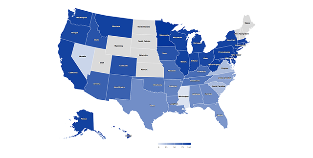
Looks good for a first cut. We first call the appropriate map data from highcharts.com. We specify the data set of interest with df. value takes a string that specifies the variable we want to chart. joinBy links the two data sets by a matching variable; in our case abbreviated state codes. I assigned a null color to differentiate zeros from NAs.
Still, the colors can use more work. At it is now, we get a spectrum between 0 and 100, with the former signaling a slide towards conservatism and the latter conveying more liberal voting patterns. You might want to assign canonical colors of the parties to advertise these shifts. For this, we need to supply stop breaks to the hc_colorAxis. Say we want to assign red to 0, white to 50 (to display moderation/on-the-fence behavior), and blue to 100:
stops <- data.frame(q = c(0, .5, 1),
                    c = c("#ea5148", "#ffffff", "#18469e"))
stops
## q c
## 1 0.0 #ea5148
## 2 0.5 #ffffff
## 3 1.0 #18469estops <- list_parse2(stops) #highcharter wrapper
map3 <- hc_colorAxis(hc, stops = stops)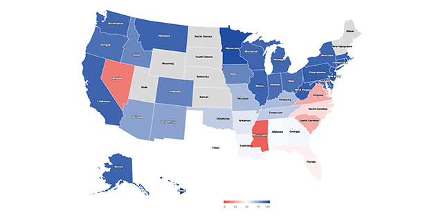
Now we can clearly differentiate between voting patterns: States with blue hues maintained a liberal agenda, whereas those that did slide into voting more conservative (remember, we are only looking at House Democrats) are colored red. Finally, let’s add a title and change the border color to grey for increased visibility. Similar to ggplot, highcharter uses the pipe operator so it’s a breeze:
hc <- highchart(type = "map") %>%
          hc_add_series_map(map = mapData, df = hd63, value = "ADA", joinBy = c("hc-a2", "StateAbbr"),
                            name = "ADA Voting Score", nullColor = "#dadada", borderColor = "grey", borderWidth = .2,
                            dataLabels = list(enabled = TRUE, format = '{point.name}')) %>%
          hc_title(text = "1963 House Democrats ADA Voting Scores")
map4 <- hc_colorAxis(hc, stops = stops)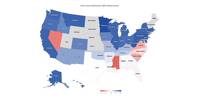
We can also convey yearly changes with a deviation plot using the ggpubr package. We have already calculated within-state change by lagging the ADA scores by one year after grouping. ggpubr as the name suggests builds on ggplot so the grammar works the way you would expect:
hd63T <- trend[trend$Year == 1963 & trend$Party == "Democrat" & trend$Chamber == 1, ]
library(ggpubr)
p <- ggbarplot(data = hd63T,
               x = "StateAbbr",
               y = "Diff",                               #use difference in nominal score
               fill = "Threshold",                       #factor identifying negative/positive scores
               color = "white", size = .1, width = 1,    #bin color, size, outline
               palette = c("#18469e", "#ea5148"),        #red/blue colorway
               sort.val = "asc",                         #sort by ascending value
               sort.by.groups = FALSE,                   #do not sort by group
               x.text.angle = 90,                        #rotate x axis text
               ylab = "Change from Last Year",
               xlab = FALSE,                             #hide x axis
               legend.title = "Trend Direction")
p +
geom_abline(slope = 0, color = "gray")                   #add a reference line at zero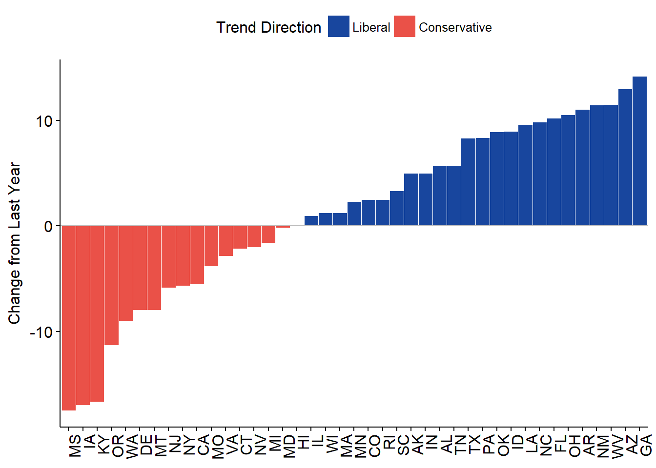
All good and well, however, showing stats from a single year (plus only one chamber, one party) is not that captivating. Enter Shiny. I will not go into the details of building the app, as the code is publicly available on GitHub.3 Instead, I will briefly touch on how to transform the above code into reactive programming.
Assume we want to allow the users to switch years, chambers, party, and ADA score type. In order words, we need to have input concerning these four variables. The easiest way is to create a dynamic subsetting mechanism. An example would be:
#Not evaluated
selectedData <- reactive({
    states <- states[states$Year == input$Year & states$Party == input$Party &
                         states$Chamber == ifelse(input$Chamber == "House", 1, 2), ]
  })
This creates a reactive data set called selectedData() that changes according to user input to any of the variables defined above. Within Shiny, you have to call reactive items with brackets (). Using them outside of reactive environments will also irritate R. Below is a screenshot of the opening page of the completed app:
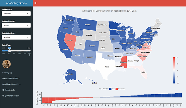
If you made it this far and still haven’t checked the app, you should do so now! The inclusion of president portraits took some consideration, however it made a strong case for starting out with JFK.
Get inspired at http://jkunst.com/highcharter/index.html↩
Literally what happened.↩
Which assumes some understanding of how Shiny works. Feel free to contact me on any one of these platforms if you have questions.↩