Projects
Interactive data science applications.
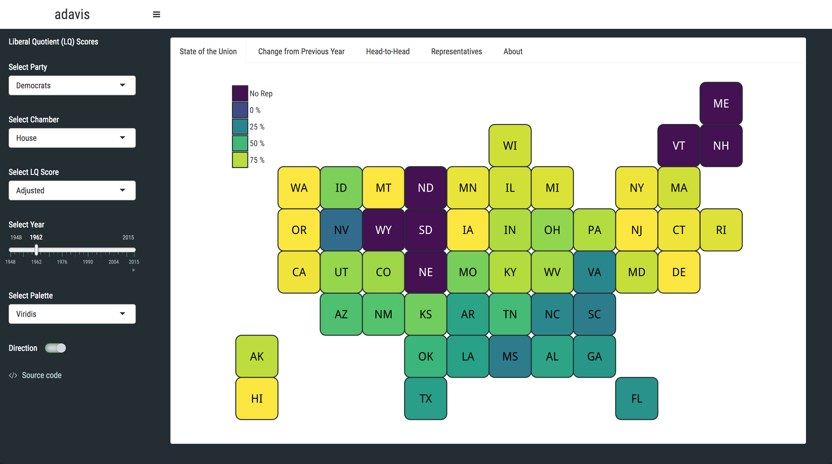
adavis: Measuring Political Polarisation in US Congress
Visualises ~36,000 US legislator voting scores collected by the Americans for Democratic Action between 1947 and 2015. Data can be grouped by year, state, chamber, and party. Built with statebins, plotly, ggExtra, and shinydashboard.
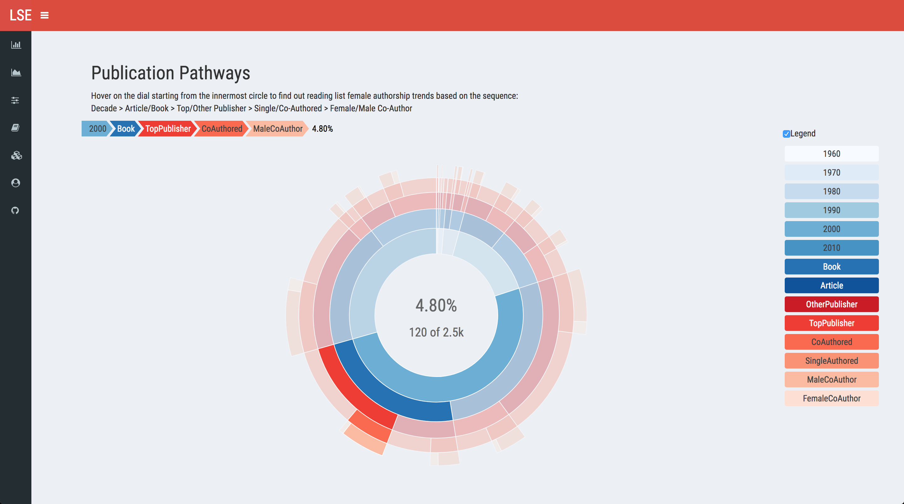
Gender Bias in Academic Reading Lists
Exploratory analysis of ~13,000 scholarly works in LSE International Relations syllabi. Quantifies publication bias in academia, mirroring US Ivy League patterns of a roughly 80/20 male-to-female author ratio. Built with shinydashboard, dygraphs, sunburstR, and DT.